It's time to create the user interface of the day view controller, the topmost child view controller of the root view controller. In this series, I show you several techniques for building user interfaces. Each of these techniques has its pros and cons. To create the user interface of the DayViewController class, we take advantage of Auto Layout and storyboards. This approach is ideal for building static user interfaces.
Defining Outlets
We first declare the outlets for the user interface components of the DayViewController class. Open DayViewController.swift.
The date and time are displayed at the top of the day view controller's view. We define two outlets of type UILabel, dateLabel and timeLabel. To configure the UILabel instances, we take advantage of a clever trick I picked up a few years ago. We implement a didSet property observer. Every time the dateLabel and timeLabel properties are set, we configure the UILabel instances.
@IBOutlet var dateLabel: UILabel! {
    didSet {
        dateLabel.textColor = UIColor(red:0.31, green:0.72, blue:0.83, alpha:1.0)
        dateLabel.font = .systemFont(ofSize: 20.0, weight: .heavy)
    }
}

@IBOutlet var timeLabel: UILabel! {
    didSet {
        timeLabel.textColor = .black
        timeLabel.font = .systemFont(ofSize: 15.0, weight: .light)
    }
}
This should only happen once, that is, when the application loads the view of the DayViewController class from the storyboard. I like this technique because it keeps the configuration of the property close to its definition.
In the didSet property observer, we set the textColor and font properties of the UILabel instance. The font of the date label is a bit larger and heavier than that of the time label. The text color of the date label is a tint of blue.
A weather application needs to be visual. We display an image that represents the current weather conditions at the center of the day view controller. We declare an outlet, iconImageView, of type UIImageView!. We set the contentMode property of the UIImageView instance to scaleAspectFit in a didSet property observer.
@IBOutlet var iconImageView: UIImageView! {
    didSet {
        iconImageView.contentMode = .scaleAspectFit
    }
}
The current temperature and wind speed are displayed on the left and right of the image view by a UILabel instance. The text color and font of the temperatureLabel and windSpeedLabel properties are identical.
@IBOutlet var temperatureLabel: UILabel! {
    didSet {
        temperatureLabel.textColor = .black
        temperatureLabel.font = .systemFont(ofSize: 17.0, weight: .light)
    }
}

@IBOutlet var windSpeedLabel: UILabel! {
    didSet {
        windSpeedLabel.textColor = .black
        windSpeedLabel.font = .systemFont(ofSize: 17.0, weight: .light)
    }
}
Below the image view, we display a textual representation of the current weather conditions in a UILabel instance. The text color and font of the description label are identical to those of the time label.
@IBOutlet var descriptionLabel: UILabel! {
    didSet {
        descriptionLabel.textColor = .black
        descriptionLabel.font = .systemFont(ofSize: 15.0, weight: .light)
    }
}
Populating the Storyboard
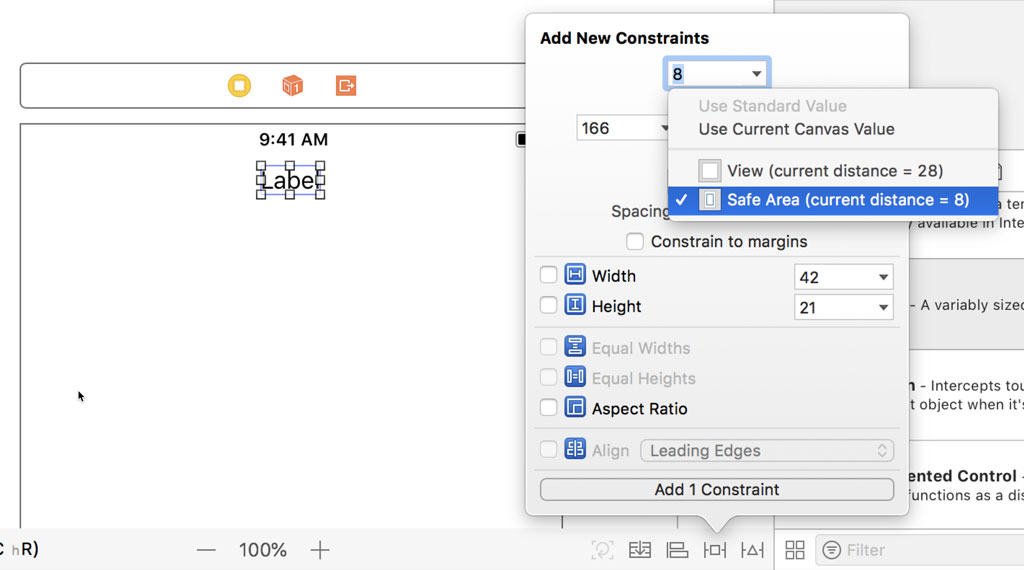
With the outlets in place, it's time to open Main.storyboard. Drag a label onto the view of the day view controller and position it at the top of the view, below the status bar. Click the Add New Constraints button at the bottom of the canvas and pin the top of the label 8 points below the safe area layout guide of the view.
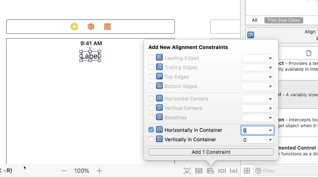
Click the Align button at the bottom and center the label horizontally in its superview. There's no need to set the width and height of the label. The label's intrinsic content size takes care of that. A label knows how wide and tall it should be by inspecting its configuration.
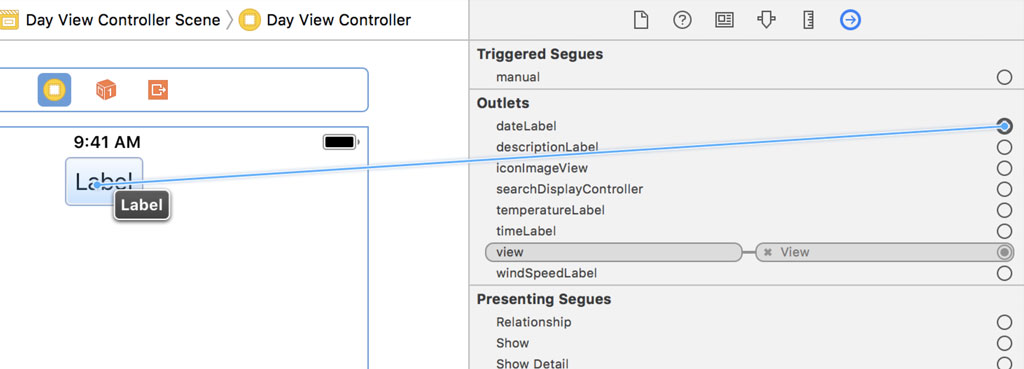
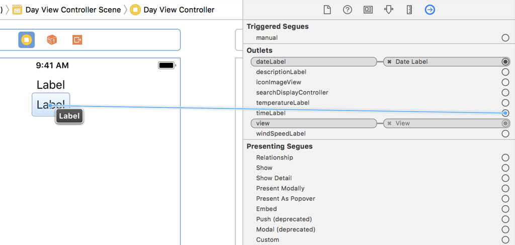
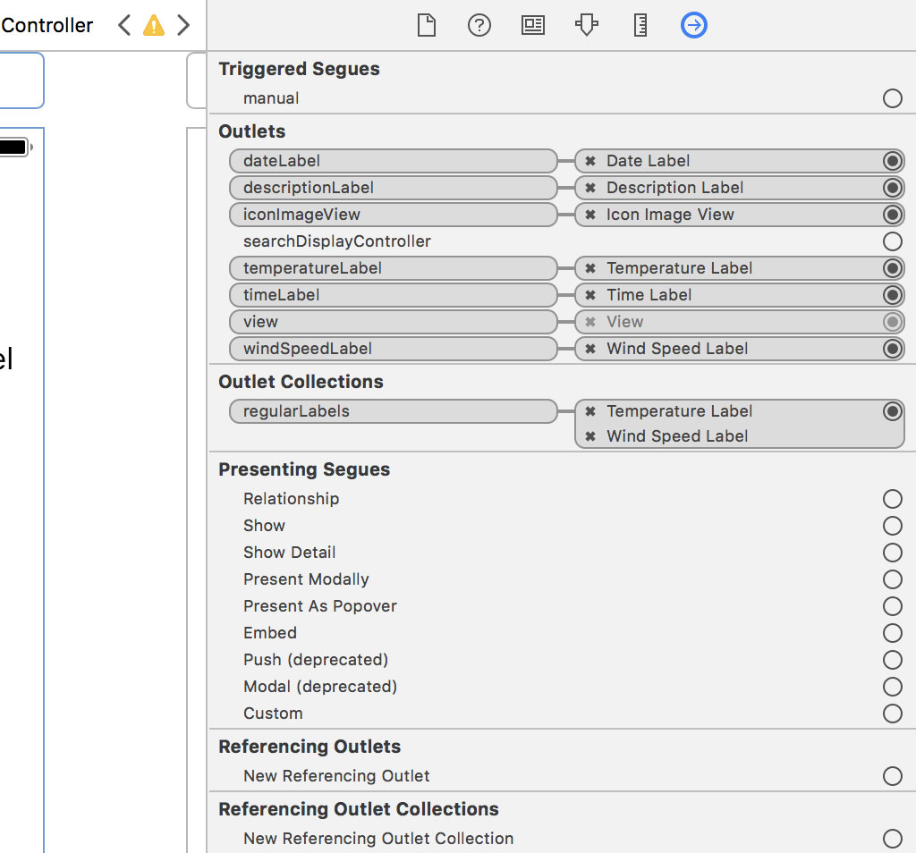
Select the Day View Controller object from the Document Outline and open the Connections Inspector on the right. Connect the dateLabel property to the label we added.
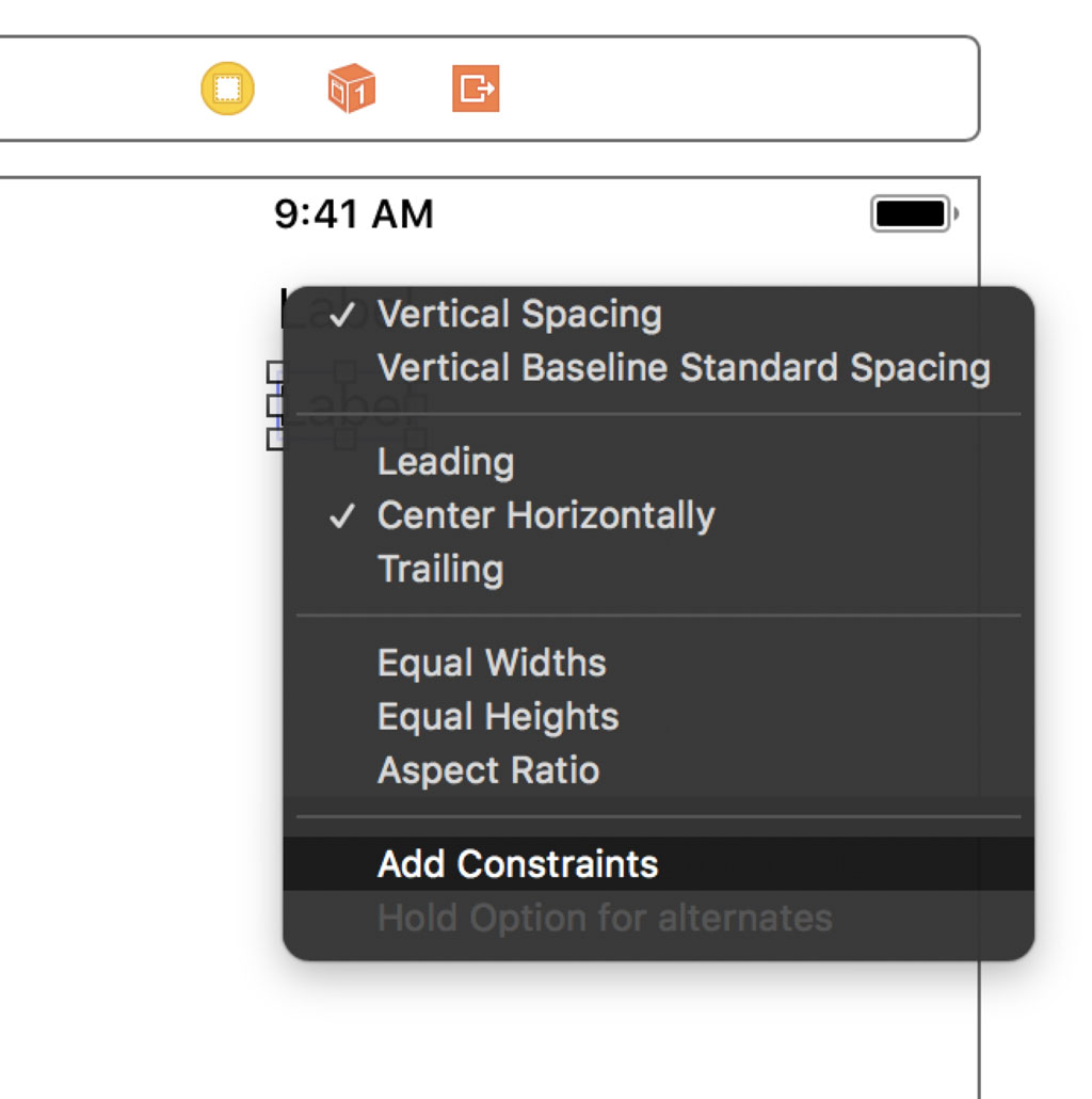
Add another label below the date label. Press the Control key and drag from the newly added label to the date label. Press the Shift key and choose Vertical Spacing and Center Horizontally from the menu that pops up. Don't forget to click Add Constraints at the bottom.
Select the Day View Controller object from the Document Outline and open the Connections Inspector on the right. Connect the timeLabel property to the label we added.
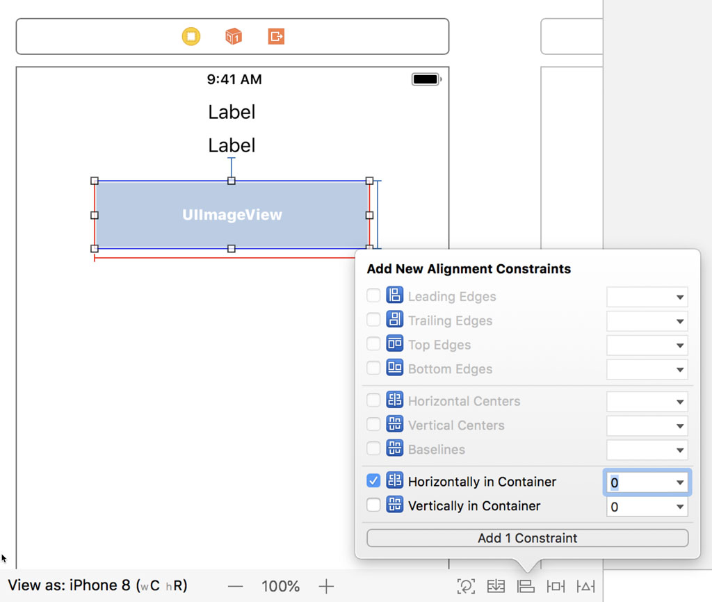
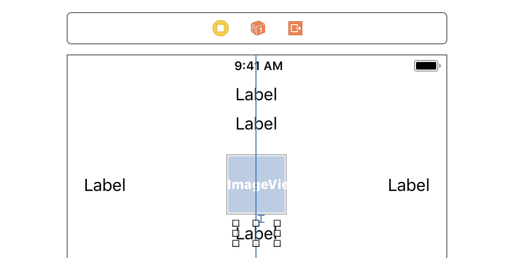
Add an image view from the Object Library to the Day View Controller Scene and position it below the time label. Click the Add New Constraints button and pin the image view's top edge 20 points below the time label's bottom edge. Set the width and height of the image view to 60 points.
With the image view selected, click the Align button and center the image view horizontally in its superview.
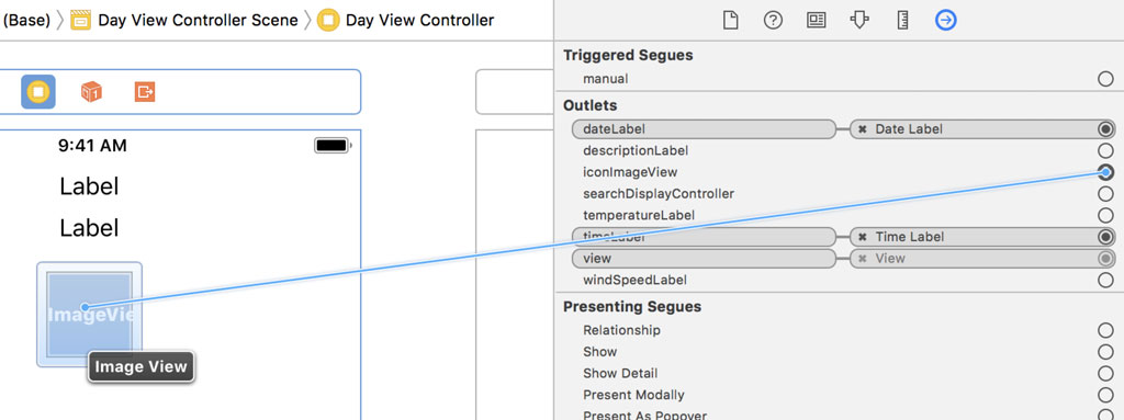
Open the Connections Inspector on the right and select the Day View Controller object from the Document Outline. Connect the iconImageView property to the image view.
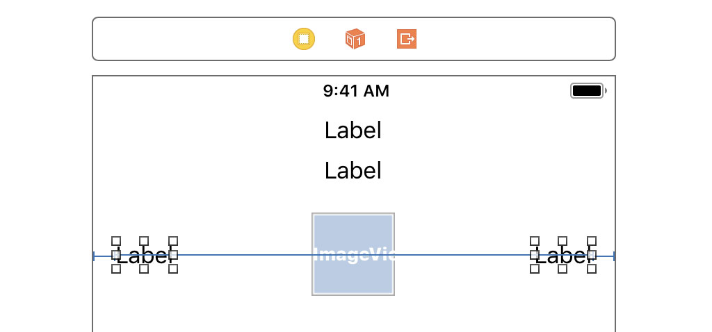
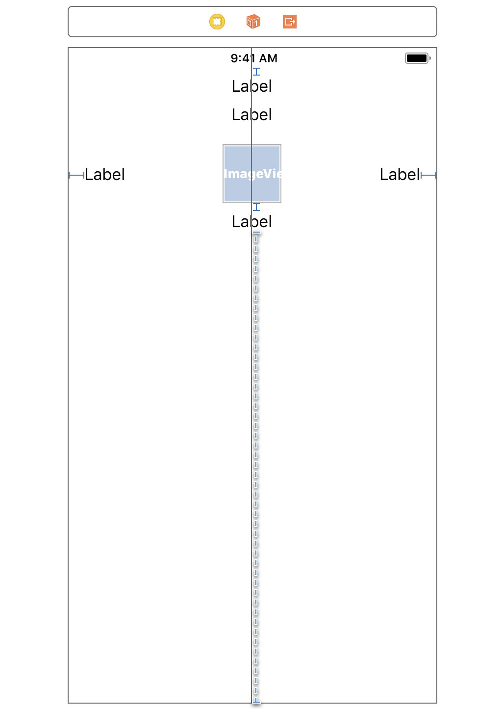
Add a label to each side of the image view. The label on the left is centered vertically relative to the image view and its leading edge is pinned at 16 points from the leading edge of its superview. The label on the right is also centered vertically relative to the image view and its trailing edge is pinned at 16 points from the trailing edge of its superview.
Open the Connections Inspector on the right and select the Day View Controller object from the Document Outline. Connect each label to its corresponding outlet.
Last but not least, add a label below the image view and position its top edge 20 points below the bottom edge of the image view. Center the label horizontally in its superview.
Connect the newly added label to the descriptionLabel property of the DayViewController class in the Connections Inspector.
Outlet Collections
Some of the labels of the day view controller have the same style, which means we can improve the implementation of the DayViewController class by taking advantage of outlet collections. Revisit DayViewController.swift and declare an outlet, regularLabels, of type [UILabel]. We define a didSet property observer in which we set the textColor and font properties of each label in the collection.
@IBOutlet var regularLabels: [UILabel]! {
    didSet {
        for label in regularLabels {
            label.textColor = .black
            label.font = .systemFont(ofSize: 17.0, weight: .light)
        }
    }
}
We can remove the didSet property observers of the temperatureLabel and windSpeedLabel properties.
Open Main.storyboard, select the Day View Controller object from the Document Outline, and open the Connections Inspector on the right. Connect the temperature label and wind speed label to the regularLabels property.
We define another outlet collection, smallLabels, of type [UILabel]. We define another didSet property observer in which we set the textColor and font properties of each label in the collection.
@IBOutlet var smallLabels: [UILabel]! {
    didSet {
        for label in regularLabels {
            label.textColor = .black
            label.font = .systemFont(ofSize: 15.0, weight: .light)
        }
    }
}
Remove the didSet property observers of the timeLabel and descriptionLabel properties. Open Main.storyboard, select the Day View Controller object from the Document Outline, and open the Connections Inspector on the right. Connect the time label and description label to the smallLabels property.
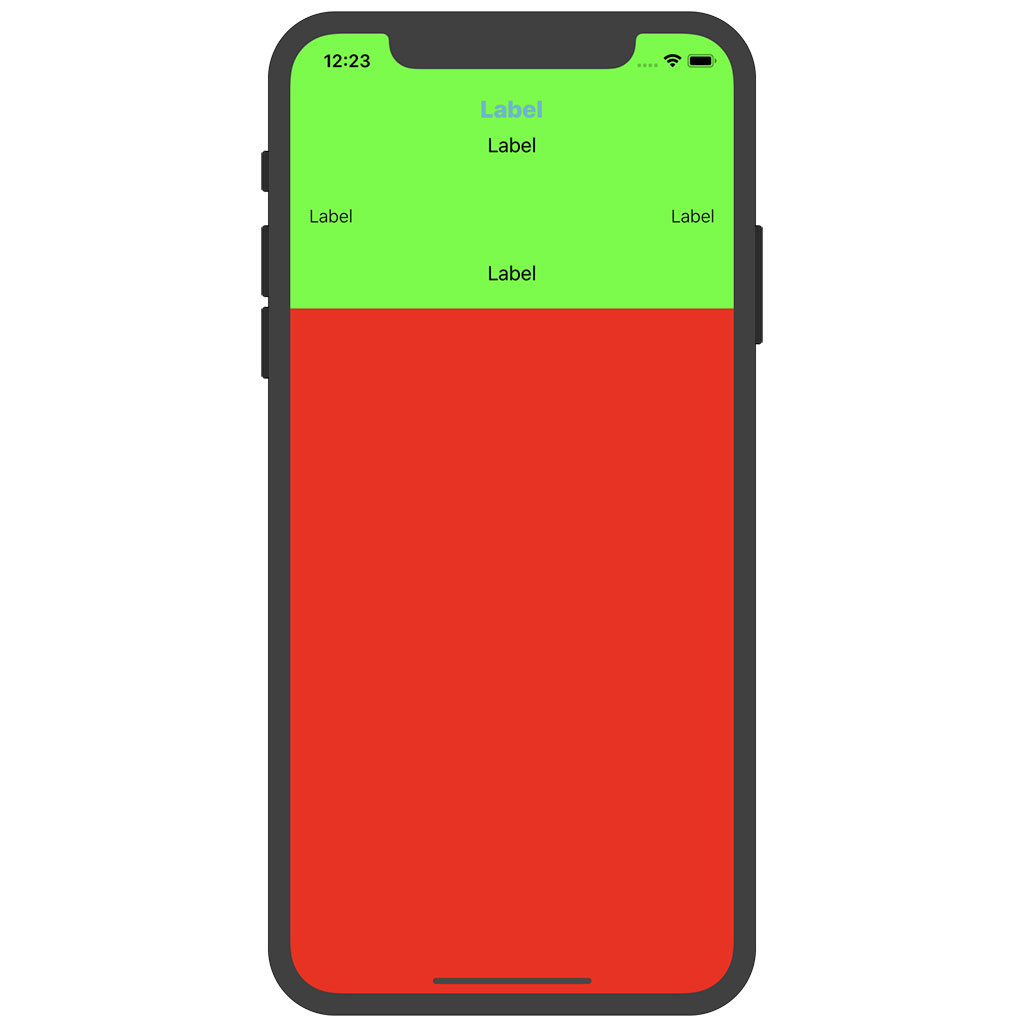
Run the application in the simulator to see the result. Because we pinned the top edge of the date label to the safe area layout guide of the view controller's view, the user interface looks good on any device, including iPhone X. The status bar and the notch of iPhone X don't affect the user interface.
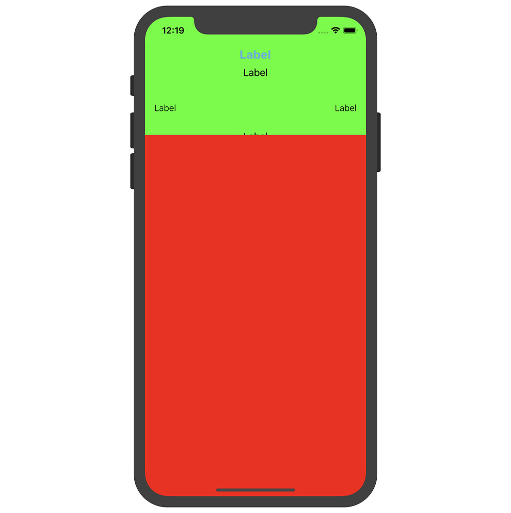
But there's another problem. The contents of the description label is clipped on some devices, including iPhone X. Earlier in this series, we set the height of the day view controller's view to 200 points. It seems that isn't enough to correctly display the user interface of the day view controller.
There are several options to fix this issue. We can increase the height of the day view controller by modifying the constant we declared in the RootViewController class. That's a clunky solution that isn't flexible or elegant. There's a much better solution, Auto Layout.
Adding Flexibility With Auto Layout
Before we implement the solution, we need to make sure the RootViewController class no longer fixes the height of the day view controller's view. Open RootViewController.swift, navigate to the setupChildViewControllers() method, and remove the height constraint of the day view controller's view.
// MARK: - Helper Methods

private func setupChildViewControllers() {
    ...

    // Configure Day View
    dayViewController.view.topAnchor.constraint(equalTo: view.topAnchor).isActive = true
    dayViewController.view.leftAnchor.constraint(equalTo: view.leftAnchor).isActive = true
    dayViewController.view.rightAnchor.constraint(equalTo: view.rightAnchor).isActive = true

    ...
}
We can also remove the private Layout enum we defined in the extension for the RootViewController class. We no longer need it.
The solution we're about to implement may seem complex if you're new to Auto Layout. Bear with me. I explain every step of the solution.
We take advantage of constraint priorities to resolve the problem. The underlying idea isn't complicated. The view of the day view controller should be able to infer its size by inspecting its subviews and their constraints.
We start simple. We fix the bottom edge of the description label to the bottom edge of its superview, setting the constant of the constraint to 20 points. This obviously results in a bunch of Auto Layout errors. The layout is unsatisfiable because we introduced a conflict.
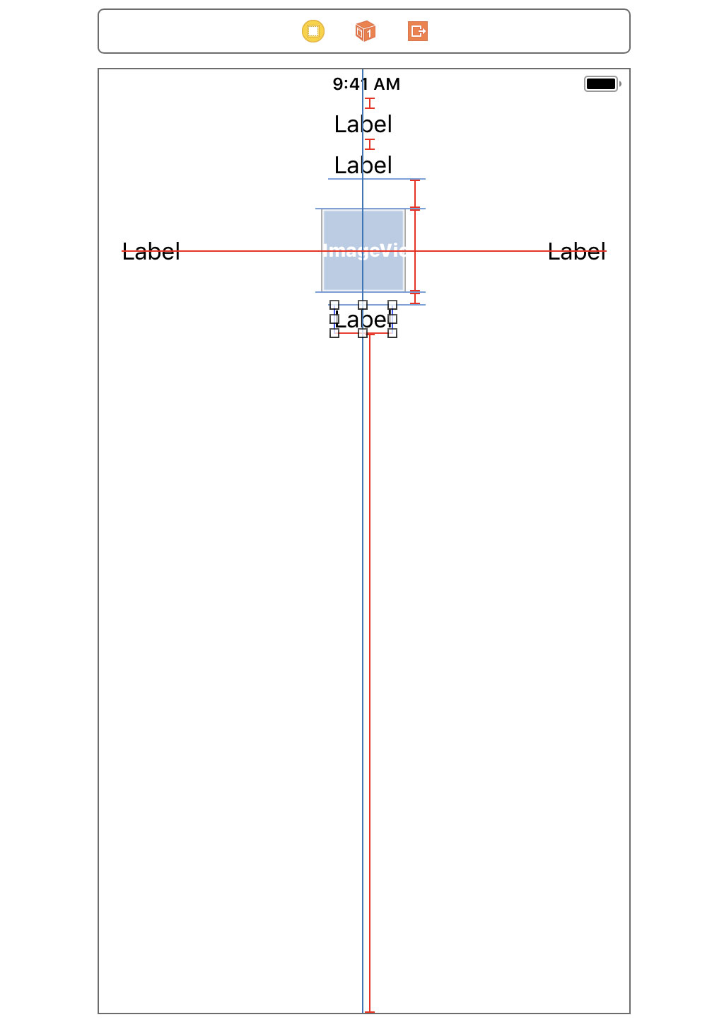
Despite the conflict in Interface Builder, the user interface looks fine if we run the application in the simulator. The conflict is only present in Interface Builder. Even though we fixed the problem, we need to resolve the errors in Interface Builder. This is easier than you might think.
Select the newly added constraint, open the Attributes Inspector on the right, and set the priority of the constraint to 250. The red line turns into a blue, dashed line. The blue color indicates that there's no longer a conflict. Why is that?
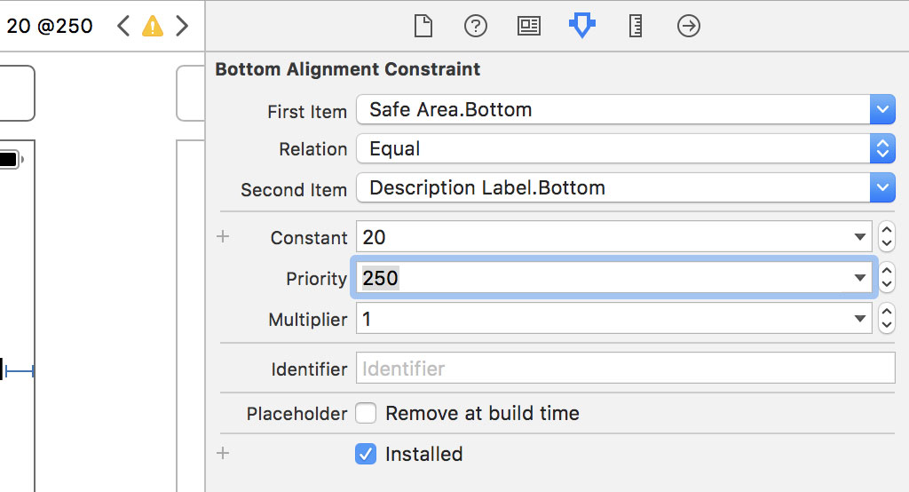
The dashed line indicates that the constraint is optional. A constraint with a priority less than 1000 is an optional constraint. The layout engine tries to satisfy the constraint if it can, but it isn't required to satisfy the constraint because it's optional. Constraints with a priority of 1000 are required. If a required constraint cannot be satisfied, then the layout is unsatisfiable.
It's important that the priority of the constraint is set to 250 or lower. The layout engine always satisfies constraints in order of priority. The vertical content hugging priority of the description label is set to 251, the default value for a label. If the vertical constraint we added has a priority higher than 251, that is, higher than the label's vertical content hugging priority, the layout engine would first try to satisfy the vertical constraint. It cannot satisfy both constraints based on the layout we designed. Let me illustrate this in Interface Builder.
Select the label and set its vertical content hugging priority to 249. The layout remains satisfiable, but the user interface looks different. The label is stretched along its vertical axis to satisfy the layout. Revert the change to restore the user interface.
Being able to resolve issues like this is essential. You can learn more about Auto Layout in Auto Layout Fundamentals.
A Few More Tweaks
Interface Builder shows us a few warnings we should resolve. Click the orange arrow in the top right of the Document Outline to reveal the warnings.
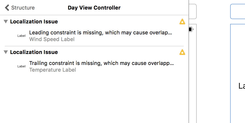
We're not required to fix these warnings, but I always make sure a project builds without warnings. That's a good practice to stick to.
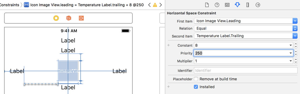
The solution is simple. Select the temperature label and pin its trailing edge to the leading edge of the image view, setting the constraint's constant to 8 points. We also set the priority of the constraint to 250. The value of 250 is lower than the horizontal content hugging priority of the temperature label.
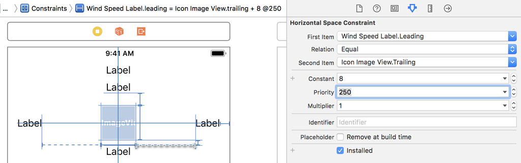
We repeat these steps for the wind speed label. Select the wind speed label and pin its leading edge to the trailing edge of the image view, setting the constraint's constant to 8 points. We also set the priority of the constraint to 250. The value of 250 is lower than the horizontal content hugging priority of the wind speed label.
We could define the constraints as required constraints. That would work if we set the text alignment of the temperature label to left and the text alignment of the wind speed label to right.
Run the application and inspect the user interface. Make sure no errors or warnings are shown.
What's Next?
In the next episode, we take a detour by implementing a lightweight solution to rid the DayViewController class of the UIColor and number literals we introduced in this episode.